TPG Community
Get online support
- TPG Community
- :
- Broadband & Home Phone
- :
- Accounts and Billing
- :
- Re: Account Usage "New and Improved?" version
Turn on suggestions
Auto-suggest helps you quickly narrow down your search results by suggesting possible matches as you type.
Showing results for
Options
- Subscribe to RSS Feed
- Mark Topic as New
- Mark Topic as Read
- Float this Topic for Current User
- Bookmark
- Subscribe
- Printer Friendly Page
Account Usage "New and Improved?" version
- Mark as New
- Bookmark
- Subscribe
- Subscribe to RSS Feed
- Permalink
- Report Inappropriate Content
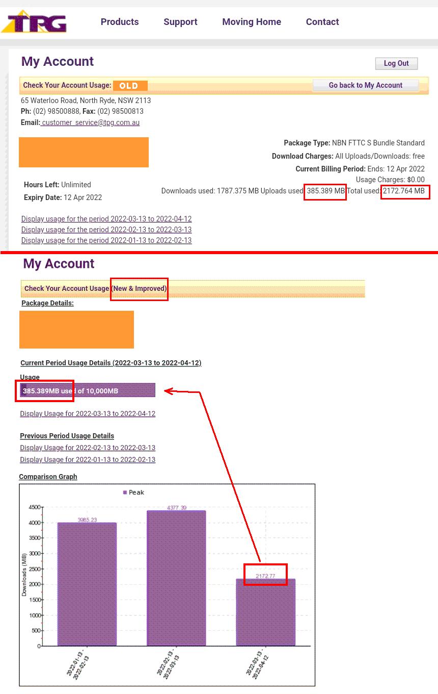
I have opted for an "NBN cable broadband S bundle" that has a data usage ceiling rather than unlimited data .. so I need to keep an eye on my usage. When I check my account data usage figures for the current period I see a large bold 12-point white on violet figure with the label "Usage" above it.
Below it is a bar graph labelled "Comparison Graph", with a tiny (<8-point) font violet usage figure above the bar for the current period. As far as I recall over several years, the two usage figures have been identical, (although I may be wrong).
At present the upper "Usage" figure shows 238.450MB while the bar graph for the same period shows shows 1550.15MB. Now I'm told by TPG that the upper figure is only uploads and the lower (bar label) is the total. There is no indication of this difference in the labels.
If this is the case, then the label "Usage" should read "Upload Usage". Better still, surely the total usage shold be shown clearly rather than as a tiny bar label in the graph.
It would appear the the "New and Improved " version needs some more improvement!
29 REPLIES 29
Anonymous
Not applicable
14-08-2019
05:15 PM
- Mark as New
- Bookmark
- Subscribe
- Subscribe to RSS Feed
- Permalink
- Report Inappropriate Content
Hi @pjl1946 ,
Welcome to the community!
We'd like to clarify if you're checking the data usage using our TPG mobile application, if so our TPG mobile application is currently under development and we yet to receive a release date for the new version.
We did an article that you may find helpful, this will guide you on how to check your online usage. Feel free to visit this link. TPG My Account - Checking your calls and usage online
Cheers!
- Mark as New
- Bookmark
- Subscribe
- Subscribe to RSS Feed
- Permalink
- Report Inappropriate Content
@Anonymous wrote:Hi @pjl1946 ,
Welcome to the community!
We'd like to clarify if you're checking the data usage using our TPG mobile application, if so our TPG mobile application is currently under development and we yet to receive a release date for the new version.
We did an article that you may find helpful, this will guide you on how to check your online usage. Feel free to visit this link. TPG My Account - Checking your calls and usage online
Cheers!
Hi Shane .. no, not a mobile, just a PC.
Could you please read my original post again carefully.
In response to your suggestion ...
The "TPG My Account - Checking your calls and usage online" leads the user to the much older version of this utility. The old version does not produce a running total, and so requires that you'd have to punch the column of individual session usage figures into a calculator and add them up. This is patently silly. The "New and Improved" option has the running total for the billing period along with the bar graph .. which is fine were it not for the fact that the "Comparison chart" bar label and the line above headed as "Usage" show entirely different figures.
I am just seeking clarification why this is so, that is, what do each of the different values really mean, and suggesting that appropriate labelling of each would be helpful.
Best Regards
- Mark as New
- Bookmark
- Subscribe
- Subscribe to RSS Feed
- Permalink
- Report Inappropriate Content
Hi @pjl1946
We thank you for raising this with us and we apologise for the confusing information posted on our site.
We have escalated this matter to the relevant team to be corrected.
For now, you may check the 'Check your account usage' site to view your remaining data while the 'new and improve' version is still being improved.
Regards,
BasilDV
- Mark as New
- Bookmark
- Subscribe
- Subscribe to RSS Feed
- Permalink
- Report Inappropriate Content
It is now almost THREE YEARS LATER and the "New and Improved" usage thing is STILL NOT FIXED.
It is a simple matter of putting the Total Usage number in the purple bar instead of the Uploads Used number. The Total Usage is what is shown above the graphs and it is what you get speed limited by, so it is the main item of interest. The rest is a side issue.
BasilDV, please escalate your escalation so it actually gets some attention.
- Mark as New
- Bookmark
- Subscribe
- Subscribe to RSS Feed
- Permalink
- Report Inappropriate Content
Adding screenshots.
Anonymous
Not applicable
11-04-2022
05:53 PM
- Mark as New
- Bookmark
- Subscribe
- Subscribe to RSS Feed
- Permalink
- Report Inappropriate Content
Hi Steve7. We raised this matter to our Accounts Team to take a look into this and fix the Data Usage Graph shown found in 'My Account'.
Regards,
It is now almost THREE YEARS LATER and the "New and Improved" usage thing is STILL NOT FIXED.
It is a simple matter of putting the Total Usage number in the purple bar instead of the Uploads Used number. The Total Usage is what is shown above the graphs and it is what you get speed limited by, so it is the main item of interest. The rest is a side issue.
BasilDV, please escalate your escalation so it actually gets some attention.
Adding screenshots.
- Mark as New
- Bookmark
- Subscribe
- Subscribe to RSS Feed
- Permalink
- Report Inappropriate Content
About a week ago someone from TPG actually rang me about this issue. He seemed quite intent on getting it fixed ...
Nothing has changed so far.
Anonymous
Not applicable
19-06-2022
11:22 AM
- Mark as New
- Bookmark
- Subscribe
- Subscribe to RSS Feed
- Permalink
- Report Inappropriate Content
Hi @Steve7,
Your case is still under investigation with our Accounts Team and we are yet to receive a feedback from them. We'll be in touch once an update becomes available. Sorry for the delay.
Regards,
Angeli
- Mark as New
- Bookmark
- Subscribe
- Subscribe to RSS Feed
- Permalink
- Report Inappropriate Content
My case which is "still under investigation with our Accounts Team" is a completely different issue which I haven't (yet) said a word about in "the Community" (but, just like this one, it shows TPG in a bad light).
This thread is about the purple bar in the "Account Usage (New and Improved)" which shows the Upload Usage" (which is only a FYI) rather than the "Total Usage" (which is the only thing that really matters).
I would be very surprised if the fix required anything more complicated than finding the particular area of HTML code in the particular web page, and changing the variable-name that means "upload usage" to the variable-name that means "total usage".
But in all the time that has elapsed since BasilDV "escalated this matter to the relevant team to be corrected" in August 2019, it seems that TPG haven't been able to assign someone to do this small fix.
(My other issue first occurred on June 9th, it has also been "escalated", and we're still waiting to again be able to use our NBN/TPG telephone to make outgoing calls. They talk about "24 to 48 hour response"...)